§ 01 — The premise
Making training accessible.
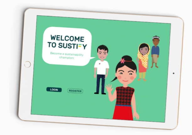
Sustify is an interactive learning app that teaches factory workers
about workplace safety and human rights.
Sustify takes a bottom-up approach, bringing training directly to
factory workers. The training runs on tablets in the factory and is
designed to work across different literacy levels, using audio and
culturally relevant illustrations alongside written content.
My work focused on how the learning content could be translated into
simple, understandable interactions. A large part of that was finding
the right visual support for the content, while considering different
literacy levels and cultural contexts.
How I learned about the users
My understanding of the users came primarily through the founder, who
had visited the factories, knew the working conditions first-hand and
tested the training on site. I combined that knowledge with the
client's requirements and my own research into accessible and
cross-cultural design.
§ 02 — Designing beyond text
Designing beyond written language.
The training was designed for factory workers in India and China,
with different literacy levels and cultural backgrounds. That meant I
couldn't rely on written language alone — but replacing text with
visuals wasn't automatically the answer either.
01
When text isn't enough
Important information needed to remain understandable without relying on reading alone.
02
When visuals need context
Icons and illustrations can be interpreted differently across cultures, so visual choices needed to be considered just as carefully as written ones.
§ 03 — Visual cues
From text to visual cues.
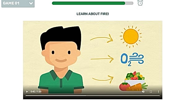
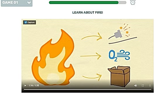
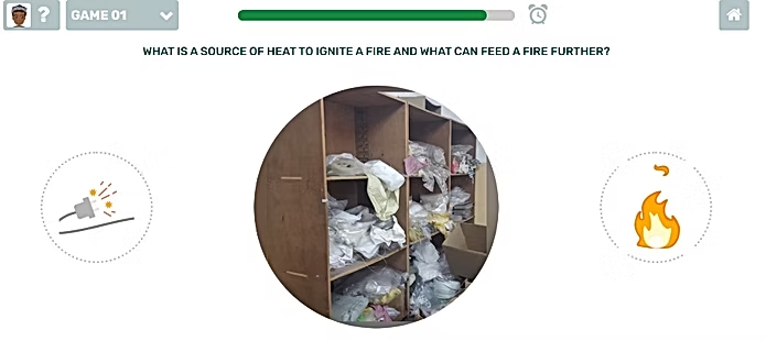
One fire safety module uses Raul, a fictional factory worker, to
explain what a fire needs to start. Raul needs heat, oxygen and food
to survive; a fire needs heat, oxygen and fuel to keep burning.
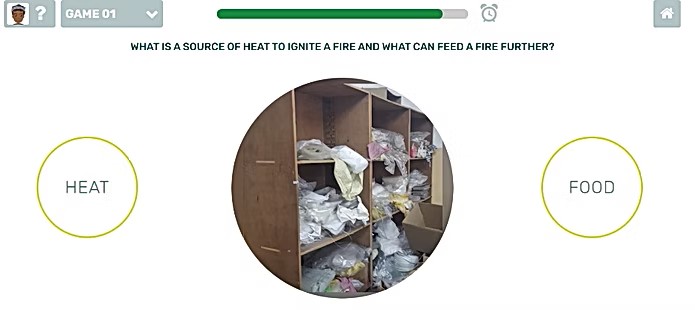
In the exercise, learners drag a photo from everyday factory life into
one of two categories: is this a source of heat that can ignite a
fire, or something that can feed a fire further? Both
categories were labelled with text alone. For workers with limited
reading skills, that made an otherwise simple task difficult to
understand.
My task was to find visual cues that could communicate the same
meaning without relying on text alone. The two categories turned out
to be very different problems.
Straightforward
Feeds the fire
A flame was a simple and recognisable visual for this category.
Harder
Source of heat
A cable was technically related to the hazard, but recognising a cable didn't necessarily mean understanding “heat”. It still required the learner to interpret what the symbol was meant to represent.
Instead of introducing another visual abstraction, I reused the
illustration from Raul's story. Its meaning had already been
established in the lesson, so the exercise could build on recognition
rather than asking learners to interpret a new symbol.
01
Analogy
Raul's story shows what a fire needs to start and keep burning.
→
02
Exercise
The same illustrations return as the answer categories.
→
03
Learner
Recognises the visual instead of interpreting a new symbol.
Icons are rarely universal. If a visual has to work without words, the understanding has to be established before the user meets it.
What the fire safety module taught me
§ 04 — Recognition and context
When recognition depends on context.
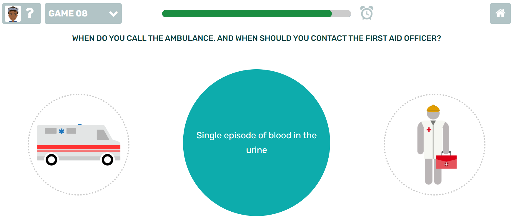
In the first-aid exercise, learners need to recognise two possible
sources of help: an ambulance and a first-aid officer. Unlike the fire
symbol in the previous example, neither of these looks the same across
cultural contexts.
So the question wasn't just how to draw an understandable icon. It was
which visual details make something recognisable locally — and which
parts of the illustration can stay the same everywhere.
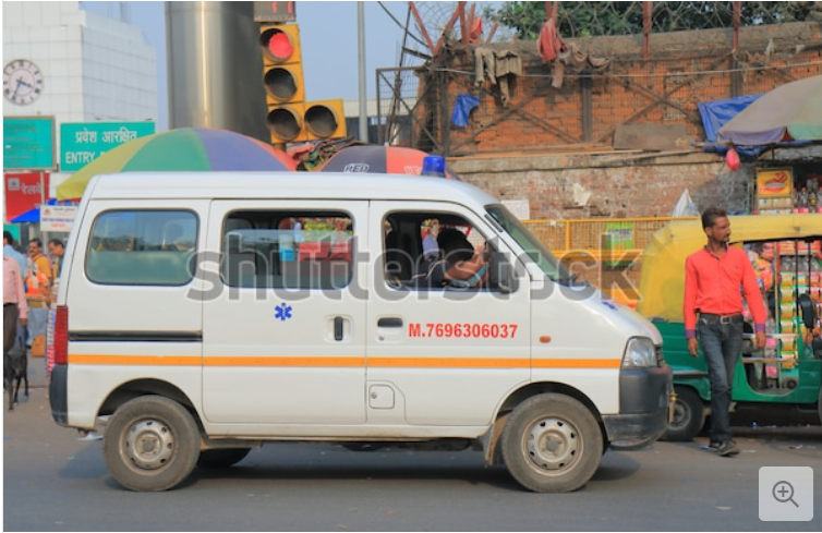
For the ambulance, I looked at which identifying details had to reflect
the local context — the blue Star of Life on the side is one of them —
and which parts of the illustration could stay as they were. The aim
was to make the visual recognisable locally without redrawing the whole
thing for every market.
§ 05 — Abstract or diversify
But what about the people?
Objects can borrow meaning from context. Human characters can't —
every face carries features, clothing and skin tone that someone will
or won't recognise as their own. There are two ways to handle that,
and they pull in opposite directions.
Strategy A
Abstracting
Move away from realistic detail, so people can fit their own identity into the image. The first-aid officer takes this route: deliberately grey, with no skin tone that could be read as one ethnicity — human-like, but nobody in particular.
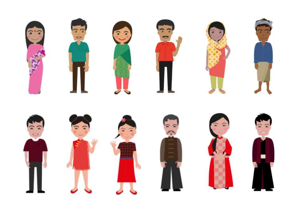
Strategy B
Diversifying
Show the range of differences people might identify with. The avatar set takes this route: differences between cultures, and differences within a single culture. It costs more work per market, but people see themselves rather than a stand-in.
Neither is the right answer everywhere. Abstracting scales — one
figure works in every market. Diversifying recognises — but multiplies
the work each time a new market is added. For Sustify, the deciding
factor was scale with low effort for change, so we went with
abstracting (the avatar set itself was designed by someone else on
the team).
§ 06 — Learnings
What I took from this.
More coming soon
As this portfolio is newly rebuilt, this case study is still being
filled in — the learnings section is on its way.