Case Study · N° 03Unite · B2B MarketplaceReading time · 10 min—
§ Case Study · Unite · B2B Marketplace
From legacy
to intuition.
A 25-year-old marketplace, rebuilt on evidence instead of assumptions.
Over five years, I helped transform a 25-year-old B2B marketplace
by redesigning its core purchasing journeys and introducing
continuous user validation into the product development process.
Client
Unite
Sector
B2B/B2G
My Role
UX/UI Designer
Focus
Buyer purchasing · Admin user management
Approach
Evidence-based design
Timeline
2024 — ongoing
Scope
Full rebuild · core flows
Status
In progress
ClassicModern
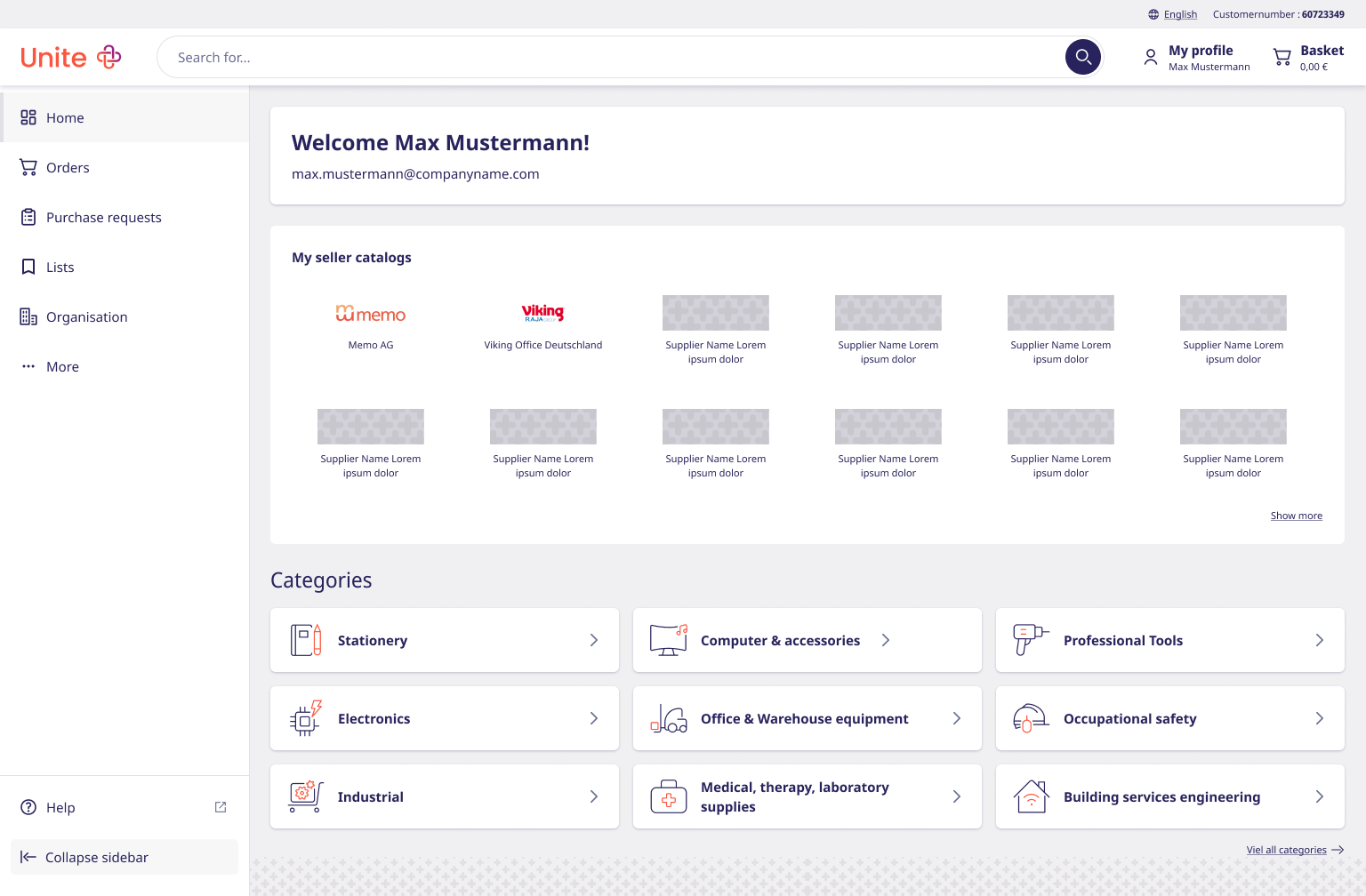
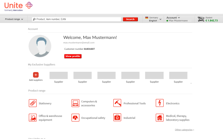
Fig. 01 — The start page, classic and modern versions. Drag the handle to compare.
§ In brief
Strategy
I brought user evidence into the redesign process, helping the product team challenge assumptions, refine the scope and make more informed prioritisation decisions.
Research
I introduced continuous prototype validation across the core journeys — planning and moderating usability tests, synthesising findings and translating them into product decisions.
Design
I redesigned critical purchasing workflows from product discovery to checkout and returns, turning research insights into tested interaction concepts for the new marketplace.
§ 01 — The starting point
A marketplace built over 25 years.
Unite's B2B marketplace connects professional buyers and suppliers
across Europe.
Over more than two decades, new features, customer-specific
requirements and evolving business needs gradually shaped the
platform into a complex product.
This redesign focused on operative purchasers — the people who use
the platform most frequently to manage day-to-day procurement.
25Years online under Unite & predecessors
2User groups the redesign was scoped around
4Core flows rebuilt on evidence
§ 02 — The challenge
The opportunity wasn't just visual — it was how we decided.
Redesigning the screens was the easy part. The real challenge was
solving three interconnected problems:
01
Growing friction across daily tasks
Unclear structures, limited orientation and unnecessary complexity made everyday tasks harder — from searching and evaluating products to checkout, returns and managing users.
02
Decisions based largely on assumptions
Product decisions had historically been shaped by internal requirements and assumptions. Regular usability testing was still new to the organisation.
03
A redesign too large to tackle at once
Rebuilding the entire marketplace in one step would have been too large and risky. The team needed to identify the most relevant problems and determine where optimisation was sufficient — and where a fundamentally new approach was required.
We needed to distinguish what still supported real buyer needs, what
could be simplified, and what had to be fundamentally rethought.
§ 03 — The goal
Build what matters — not simply what already exists.
The goal wasn't to reproduce the legacy marketplace in a new interface.
It was to create a clearer purchasing experience around the actual
needs of operative purchasers — while preserving the workflows that
still delivered value.
Three questions guided the redesign:
?
What should we preserve?
Which existing workflows still supported how operative purchasers actually worked?
?
What was missing?
Which user needs were not adequately supported by the legacy platform?
?
What could we simplify?
Where did unnecessary complexity make everyday purchasing tasks harder?
§ 04 — My approach
Using evidence to redesign critical workflows.
Working closely with Product Management and Development, I gradually
integrated continuous validation into the redesign process.
Every core flow was tested with operative purchasers — but the method
depended on the complexity and implementation risk of the change:
interactive prototypes for larger, development-intensive concepts
like checkout and returns; the live system for smaller, faster
improvements.
01
Define the problem
Solve the right problem before designing the solution.
02
Explore solutions
Make ideas tangible before investing in development time.
03
Test it with buyers
Replace assumptions with real user feedback.
04
Learn & refine
Improve the design before it reaches production.
"For the first time in the company's history, we validated ideas
before building them — and made product decisions based on
actual user needs."
— The shift this project introduced
§ 05 — The buyer behind the workflows
Anke, Operative Purchaser.
Anke manages recurring day-to-day purchases across products and
suppliers while following internal procurement requirements.
Find and compare suitable products efficiently.
Evaluate price, availability and delivery conditions.
Fig. 02 — Anke's core journey, in two sequences: Discovery (homepage, search, product) and Transaction (basket, checkout).
§ 06 — Finding the right product
Homepage, search, product page — three parts of product discovery.
Homepage, search and the product page support different parts of
the product discovery journey.
While we looked at the journey as a whole, each step had its own
usability problems that needed to be addressed in the redesign.
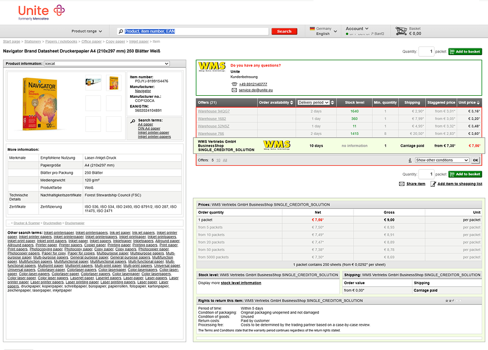
The old flow
1Homepage
2Account
3Search results
4Product page
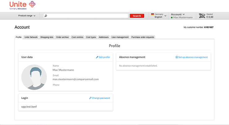
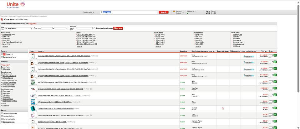
Fig. 03 — The legacy flow. Step through Homepage → Account → Search → Product page.
1Homepage & account
2Search results
3Product page
01
The hypothesis & story
Buyers were spending too many clicks on basic account tasks. Getting to routine tools like order history or saved lists meant opening a top dropdown, landing on a generic summary page, and picking the option a second time from a new set of tabs. I figured moving everything into a simple, permanent sidebar would cut out those extra steps and let buyers just get on with their work.
02
Testing insights
Repetitive clicks: Clicking a dropdown item dumped buyers onto a generic page with a second row of tabs showing the exact same options — forcing two clicks to reach one destination.
Hidden daily tools: Essential procurement workflows, like order history and shopping lists, were buried behind hover menus instead of being visible right away.
Lost context: Buyers lost their place because the navigation layout completely shifted when they moved from shopping for products to checking account settings.
03
What changed & why
Hidden dropdown → Persistent sidebar
Change: Replaced the top-right account dropdown with a permanent left-hand sidebar.
Why: Keeps core tools always visible so buyers can switch tasks in one click without opening extra menus.
Removed redundant tab pages
Change: Scrapped intermediate profile pages that duplicated dropdown options in a horizontal tab bar.
Why: Flattens the site structure, removing dead-end pages and keeping navigation predictable across the platform.
01
The hypothesis & story
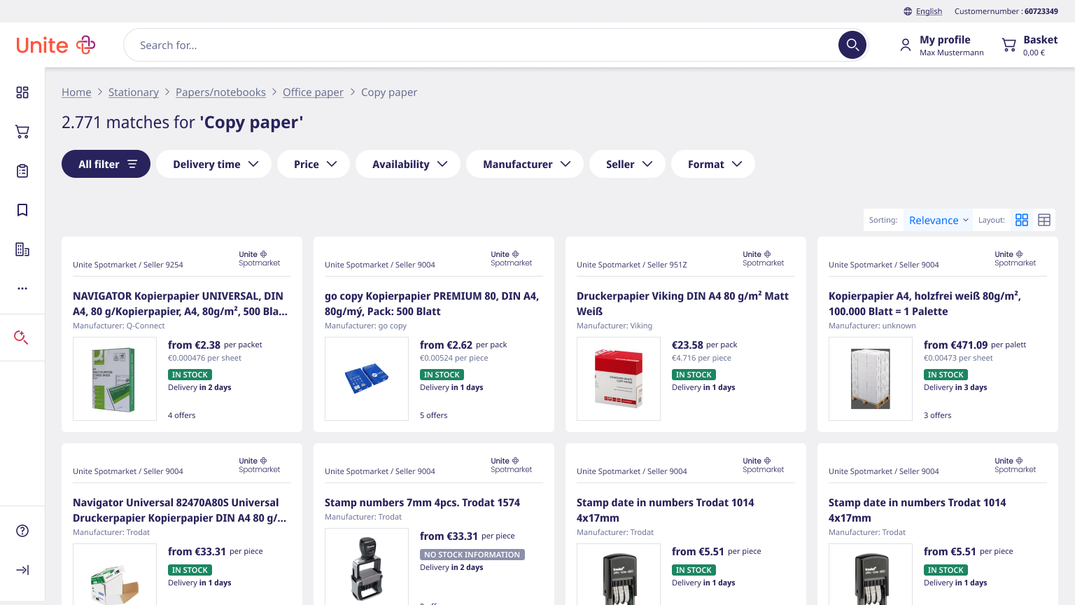
Buyers were losing time trying to scan an overcrowded search page. With filters, view modes, and sorting controls scattered to the screen edges while results sat in one flat table, nothing stood out and nothing was easy to compare. I figured rebuilding the page around a clear visual hierarchy — bringing key controls front and center — would make finding products feel effortless.
02
Testing insights
Scattered & split filters: Attribute filters sat in a huge top block while category filters were tucked into the left sidebar. Buyers struggled to find tools because filtering was split across two separate screen areas.
Unfindable layout switch: The gallery view was labeled "Large product images" and buried at the bottom of the left sidebar. Users missed it entirely, assuming no visual grid view existed.
Hidden table sorting: Sorting was hidden inside tiny column header arrows in the results table. Buyers missed the feature because there was no obvious "Sort by" control.
03
What changed & why
Split filters → Unified top filter chips
Change: Combined the top block and left sidebar filters into a single row of top-aligned filter chips.
Why: Puts all refinement tools in one predictable spot right under the search bar so buyers can filter without scanning two screen edges.
Buried links → Explicit view & sort bar
Change: Moved sorting into a clear dropdown (Sort by: Relevance) and placed simple view icons (Grid / Table) right next to it.
Why: Replaces confusing text links ("Large product images") with clear visual icons, making view switching instant.
Dense table → Scannable product cards
Change: Transformed row-by-row table data into distinct product cards with clear pricing, stock badges, and direct buy controls.
Why: Groups essential decision facts together so buyers can compare products without reading across wide table columns.
01
The hypothesis & story
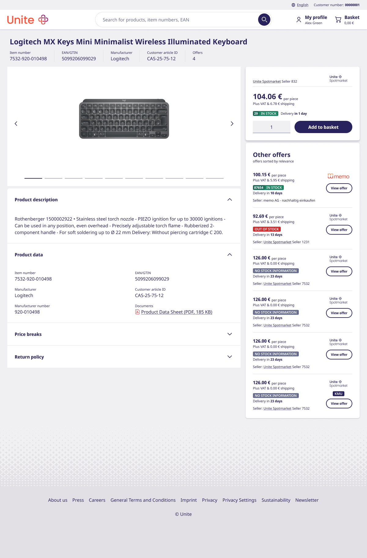
The old product page made a simple purchase feel like a multi-step puzzle. Buyers had to cross-reference top seller lists with bottom pricing tables just to figure out what they were buying, while two competing "Add to Basket" buttons added extra confusion. I hypothesized that consolidating everything into a single, unified Buy Box would eliminate the guesswork and speed up ordering.
02
Testing insights
Two basket buttons created confusion: Having an "Add to basket" button both in the top header area and at the bottom of the vendor table left buyers unsure which specific offer they were actually buying.
Split vendor & price data: The top table showed seller options, but buyers had to scroll down to a separate section to view volume discount tiers and shipping conditions for that specific seller.
Walls of unformatted specs: Technical details, compliance info, and return rules were crammed into a massive, raw table on the left, making it exhausting for buyers to scan for specific specs.
03
What changed & why
Two basket options → One primary "Buy Box"
Change: Consolidated the top seller's price, stock badge, quantity selector, and main buy button into one clear card on the right.
Why: Eliminates confusion around which offer is selected and gives buyers a single, predictable place to place an order.
Scattered vendors → "More offers" list
Change: Moved secondary seller options into clean, stacked cards directly below the main Buy Box.
Why: Keeps seller comparison close to the buy action without cluttering the screen with competing full-width tables.
Why: Cleans up the initial page view while keeping deep technical details easily accessible when buyers need them.
The redesigned flow
1Homepage
2Search results
3Product page
2
34
Fig. 04 — The redesigned discovery flow. Step through Homepage → Search → Product page.
Validation
Each of these changes was tested with operative purchasers. The
sidebar and filter chips were understood immediately — buyers used
them without prompting. The product page took longer: several
rounds of the buy box still left buyers unsure which offer they were
looking at, and testing hasn't reached full satisfaction yet — it's
still being iterated on.
§ 07 — The transaction flow
Basket and checkout — one transaction flow.
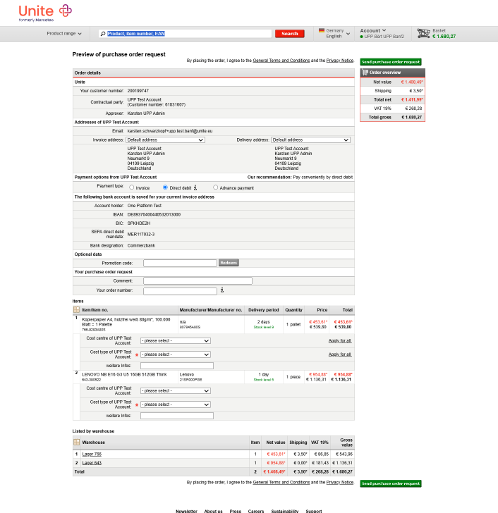
The old checkout placed everything on a single page — addresses,
payment details, cost centres, order numbers and individual line
items. Especially for multi-item orders, this made information
difficult to review and mistakes easy to miss.
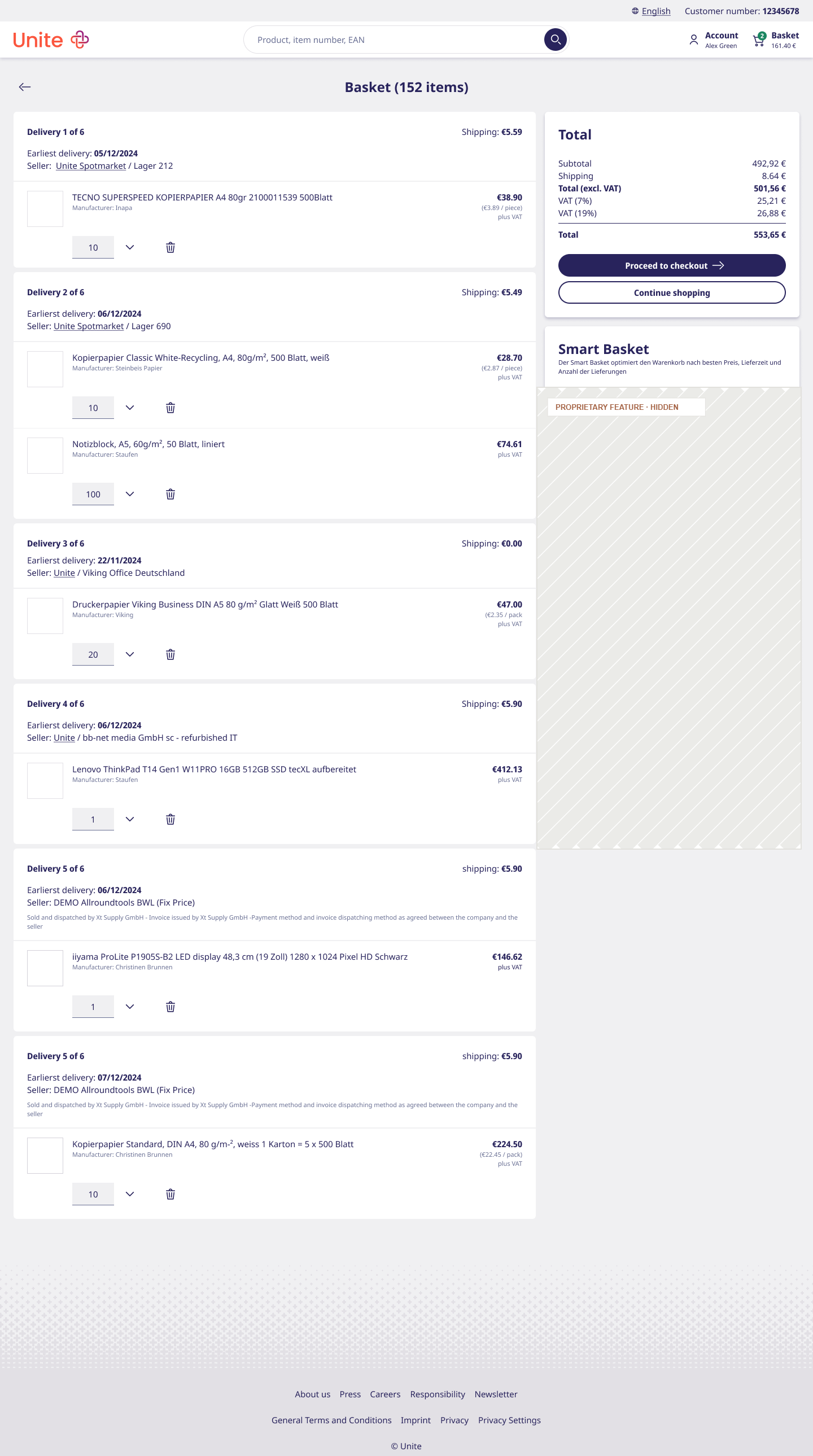
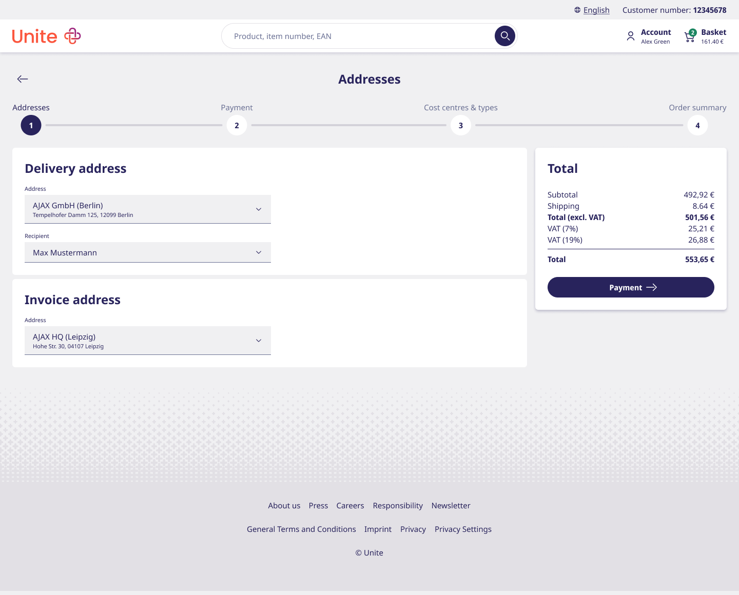
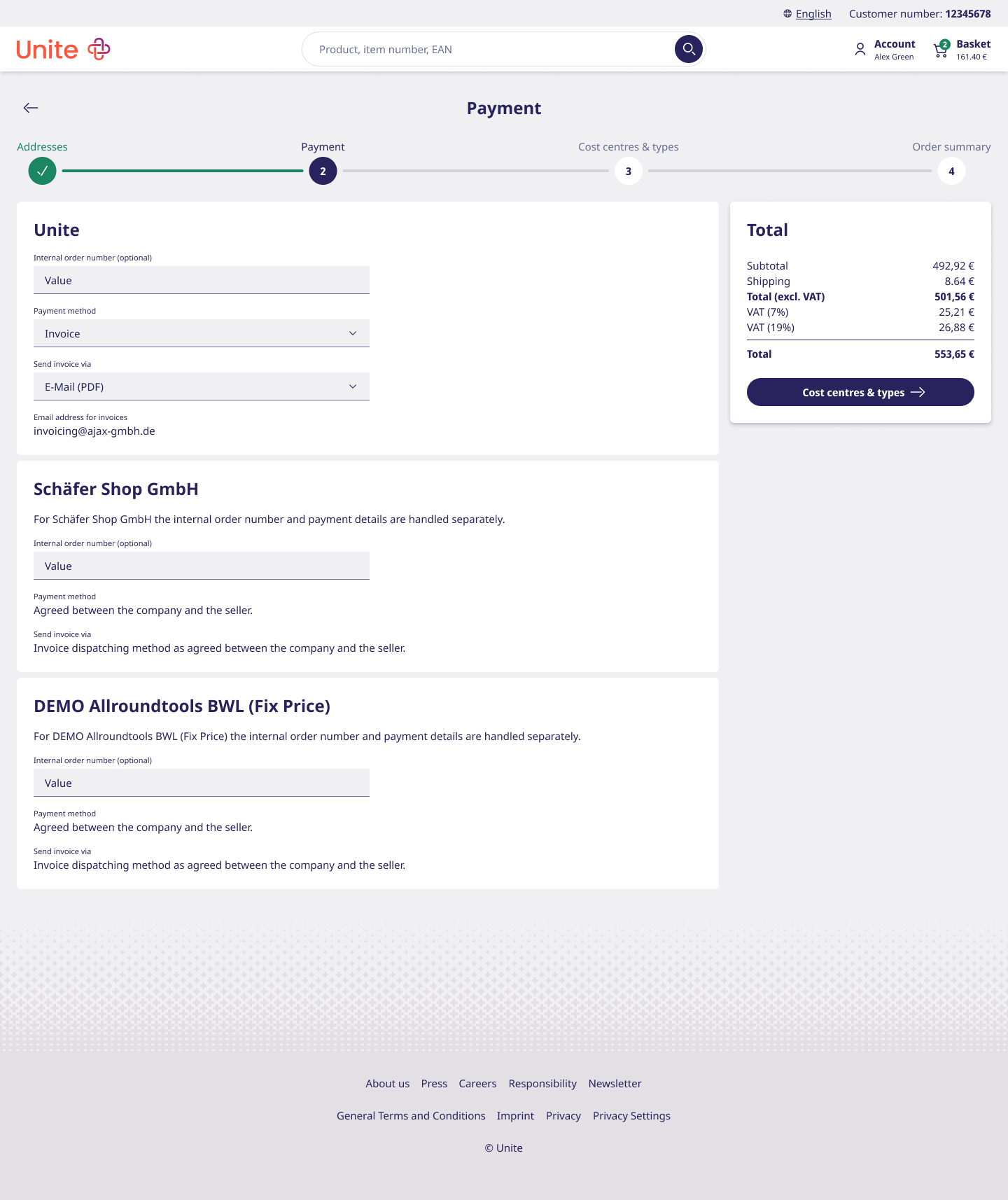
The redesigned flow guides buyers from reviewing their basket to
placing the order. Related information is grouped into four
checkout steps, with a progress bar showing where buyers are in the
process and what comes next.
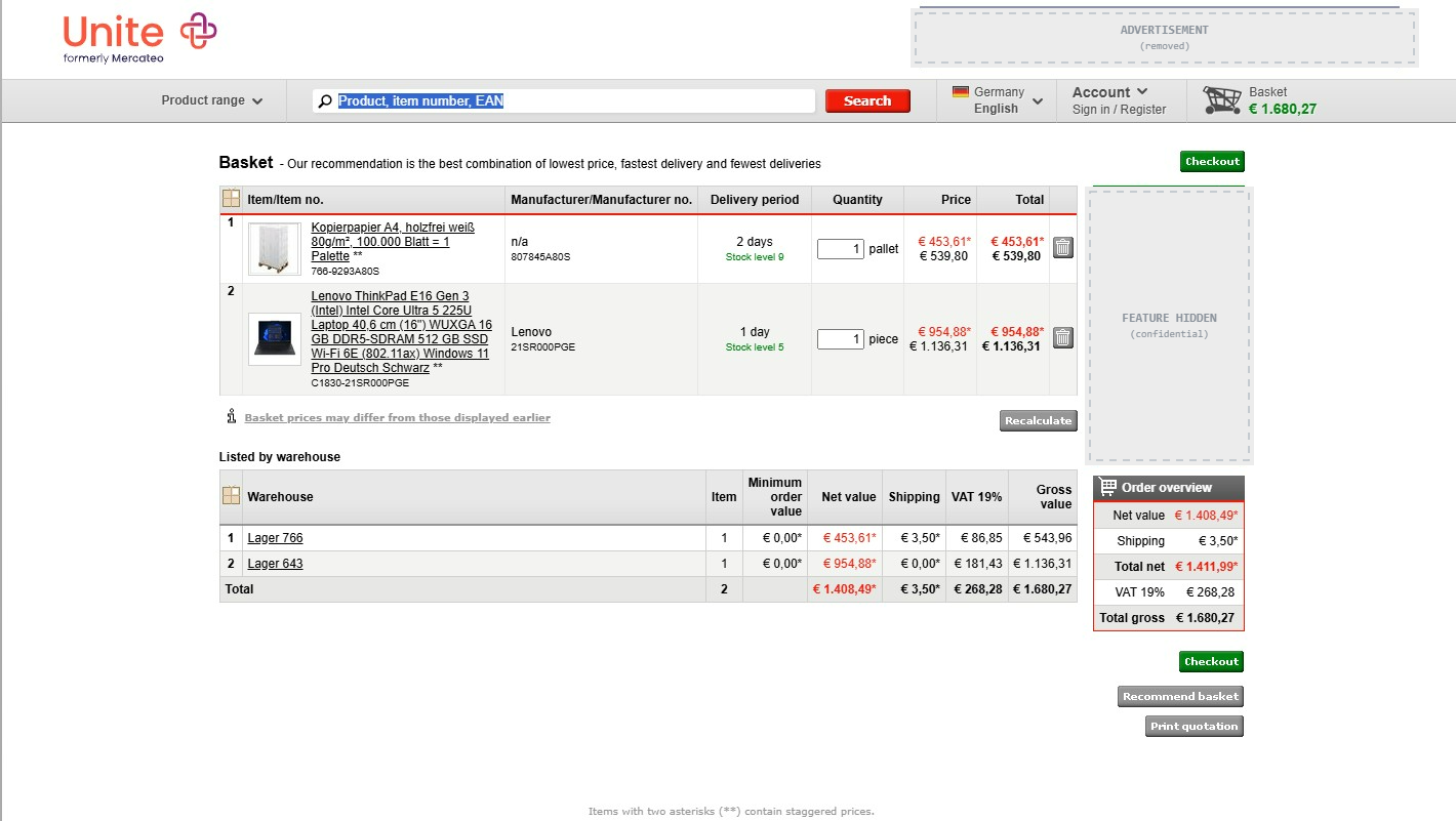
The old flow
Fig. 05 — The legacy checkout: basket, then one endless request page. Switch between the two stages above.
1Basket
2Checkout
01
The hypothesis & story
Buyers were struggling to make sense of a crowded, technical basket page. The old design dumped raw warehouse breakdown tables and complex optimization radio buttons right next to the checkout button, creating heavy visual noise and making order totals hard to verify at a glance. I figured separating item groupings from checkout totals and simplifying the "Smart Basket" optimization tools would make approving an order fast and stress-free.
02
Testing insights
Overwhelming data tables: Showing a full "Listed by warehouse" accounting table underneath the main item list forced buyers to read through redundant logistical data just to check their cart.
Competing visual priorities: The primary "Checkout" action sat above a dense green "Basket optimisation" box, making it hard for eyes to establish a natural top-to-bottom checkout flow.
Confusing optimization choices: Radio options like "Fastest delivery", "Best price", and "Without optimisation" were presented as a wall of technical stats, making buyers hesitate over which mode was actually active.
03
What changed & why
Raw tables → Grouped shipment cards
Change: Grouped products into clear, distinct shipment containers (Delivery 1 of 2, Delivery 2 of 2) with clear supplier info and estimated delivery dates.
Why: Shows buyers exactly how their order will ship without cluttering the page with raw warehouse breakdown tables.
Scattered totals → Dedicated checkout summary
Change: Consolidated subtotal, VAT, shipping, and the primary action button ("Transfer basket to ERP") into a clean, sticky sidebar on the right.
Why: Creates a clear visual hierarchy so buyers can instantly review final costs and proceed to checkout without distraction.
Dense radio list → Visual "Smart Basket" widget
Change: Redesigned basket optimization into a clean "Smart Basket" card placed neatly below the order summary, clearly highlighting the recommended option ("Our recommendation").
Why: Simplifies complex optimization logic into straightforward, scannable cards so buyers can trust the platform's recommendation in seconds.
01
The hypothesis & story
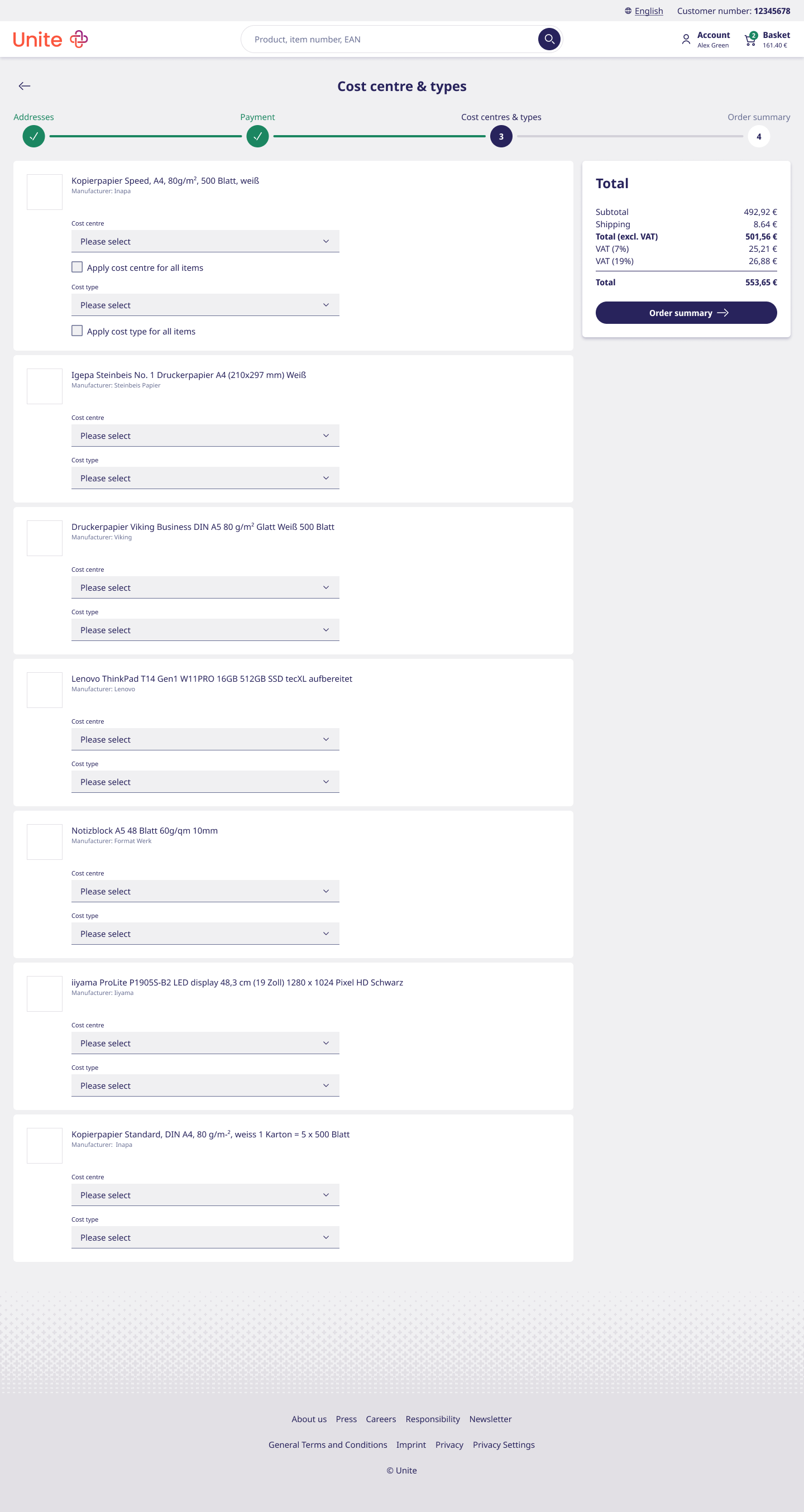
Buyers were overwhelmed by a massive, single-page checkout form that dumped addresses, payment info, cost centers, and warehouse summaries onto one screen. Trying to fill out complex accounting dropdowns inline while reviewing items caused frequent errors and cognitive overload. I figured breaking the checkout into a focused, 4-step wizard (Addresses → Payment → Cost Centres → Order Summary) would guide buyers smoothly through the process without terrifying them with a wall of fields.
02
Testing insights
One-page form fatigue: Putting addresses, SEPA mandates, promo codes, cost centers, and item lists on one continuous page made buyers feel like they were filling out a tax form, leading to skipped inputs.
Inline cost-center friction: Assigning cost centers and cost types directly inside the product list (with individual "Apply for all" buttons) clogged up the item review area and caused input mistakes.
Unclear checkout progress: Without step indicators, buyers couldn't tell how close they were to finishing the order or whether clicking "Send purchase order request" was final.
03
What changed & why
Giant single page → Linear 4-step wizard
Change: Separated checkout into 4 distinct steps with a clear, top progress bar (1. Addresses, 2. Payment, 3. Cost centres & types, 4. Order summary).
Why: Keeps the screen clean and lets buyers focus on one decision at a time without feeling overwhelmed.
Embedded forms → Dedicated step screens
Change: Gave addresses, payment details, and cost center assignments their own dedicated, full-width step cards.
Why: Eliminates visual clutter so buyers can set up complex B2B accounting rules cleanly before seeing the final summary.
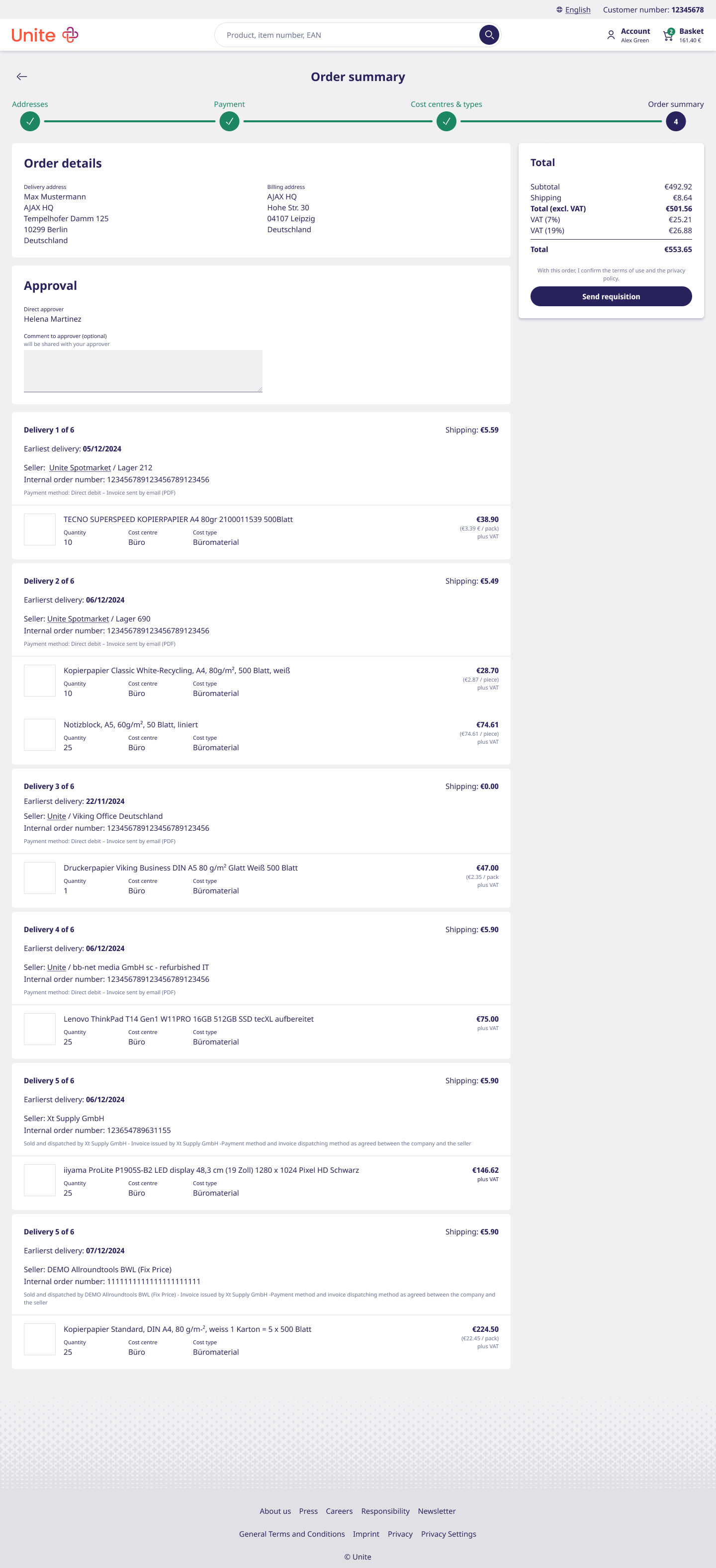
Cluttered form → Final review & approval step
Change: Created a dedicated Order summary screen (Step 4) that pulls together delivery addresses, approver notes, and item breakdowns right next to the final "Send requisition" button.
Why: Gives buyers complete confidence that all details, approvals, and totals are correct before submitting the purchase order.
The redesigned flow
1Basket
2Addresses
3Payment
4Cost centres & types
5Order summary
Fig. 06 — The redesigned flow. Step through Basket → Addresses → Payment → Cost centres & types → Order summary.
§ 08 — The outcome
From "we think" to "we know."
The clearest outcome isn't a single metric — it's that the way the
product gets decided changed. The redesign was the visible result;
the shift underneath it is what lasts.
Decisions
Grounded in evidence.
Product decisions became increasingly grounded in customer evidence rather than internal assumptions.
Process
Validated before built.
Concepts were tested with operative buyers before implementation — so effort went where the value was.
Culture
Feedback, made routine.
Customer feedback became a regular input to design, not an occasional checkpoint.
And the visible result: core procurement workflows — search, the
product page, checkout, and returns — were simplified
and modernised, each one shaped by testing rather than guesswork. The
project is ongoing; harder numbers (task time, adoption, support load)
are being tracked as flows reach more pilot users.
§ 09 — What I'd do differently
Learnings.
★ TBD · Placeholder
As this portfolio is newly rebuilt, this case study is still being
filled in — the learnings section is on its way.
Honest reflections — what the evidence-based approach got right, where
it was slow or hard to sell internally, and what you'd change next
time. Especially powerful here: shifting an organisation from a
feature-first habit to validating before building.
→ Drop in: 3 short reflections · ideally one on research, one on design, one on stakeholder buy-in
In short.
We modernised a complex, 25-year-old marketplace by replacing
assumptions with evidence — and rebuilt its core workflows around how
operative buyers actually work, testing what mattered before building it.
The purchasing experience did not end with finding and ordering
products. Behind every order were administrators who had to create
users, assign responsibilities and manage permissions across
different teams and organisational structures.
As part of the marketplace redesign, I explored how user management
could better support this work.
§ 02 — The legacy system
Built around individual users, not organisations.
The existing user management had grown around individual accounts
and permissions, rather than the structure of the companies using
it.
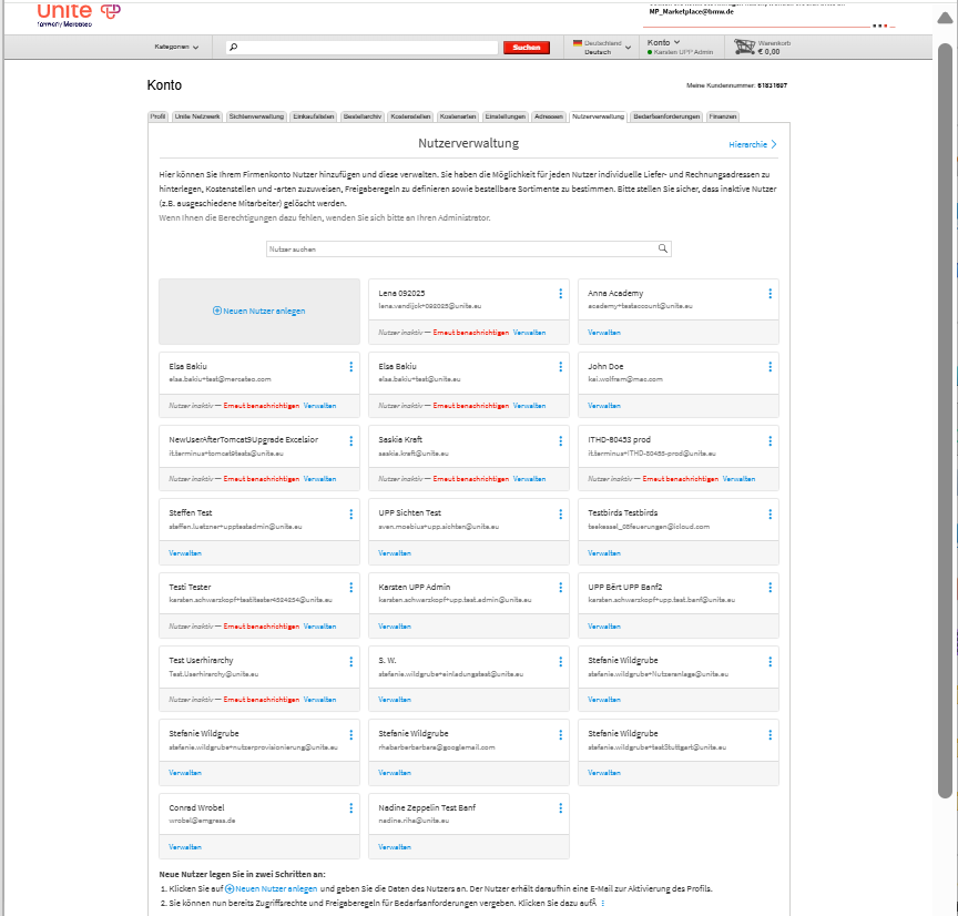
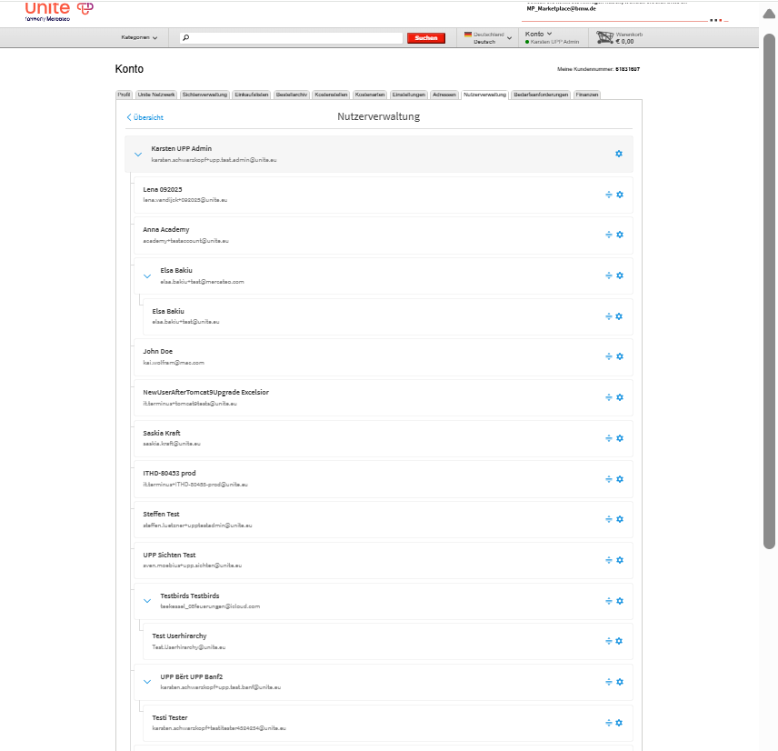
Fig. 08 — The legacy overview and its hierarchy view. Switch between the two above.
1
Limited organisational context. A card showed a name and email, but no information about the user's role, team or position in the organisation.
2
The hierarchy was hard to read at a glance. Everything expanded at once, with no way to focus on one branch — making it difficult to see where a person actually sat in a larger organisation.
§ 03 — Starting with what we already knew
Starting with what we already knew.
The redesign didn't start from a blank page.
Feedback collected by Customer Care and Key Account Management had
already highlighted recurring problems in user management. Based on
these insights, we defined initial assumptions and created an early
prototype.
We used the prototype as a starting point for the customer
interviews. We wanted to understand:
whether the concept addressed the most important needs
which problems or use cases we had missed
how the proposed structure matched administrators' everyday work
§ 04 — Research
Understanding how companies manage users.
I interviewed administrators and managing users from ten customer
companies. The conversations revealed recurring challenges around
finding users, assigning permissions and managing larger
organisational structures.
I mapped the findings from these conversations onto a board, grouped
into pain points, user needs, what the prototype already validated,
and new suggestions that came out of the sessions.
Pain points
Reordering users is fragile and error-prone
Hierarchy view is cluttered and confusing
Reporting structure is unclear
Only one admin account possible
Overview is overwhelming and unstructured
No search function in the hierarchy
Creating a user is fragmented and time-consuming
Can't assign everything during user creation
Too many clicks on permissions
No option to manage users in bulk
Overview shows too little info — department, address, location
User needs
Assign admin rights at approval level, department or location
See key info at a glance — role, department, cost centre
Apply permissions to user groups or roles
Upload and manage multiple users at once
Set all necessary details during user creation
Delegate admin rights with flexible scope
Validated with the prototype
UI feels modern and intuitive
Clear structure and overview
Manual editing the hierarchy in the settings is great
Approver selection + editing rights, costs, on during user creation is valued
Additional information on the user overview and hierarchy is helpful
Filter and search options on overview and hierarchy are appreciated
User creation flow makes sense
Remove gaps (e.g. grouping, multi-admin known) — not a priority
Suggestions & ideas
Allow users to customise the hierarchy view by introducing user groups
Add option to assign addresses and cost types during setup
Make the hierarchy slimmer
Enable creating multiple users at once
Offer templates for user creation
Support multiple admins or approval roles
Allow assigning permissions to groups instead of individuals
Fig. 12 — The affinity board, grouped from interview notes across ten companies.
Across the board, six recurring needs kept surfacing:
1
More than one person needs administrative access. Currently, only one person could manage the entire company account. This created dependencies and made it difficult to distribute administrative work across departments or locations.
2
User lists need organisational context. Names and account details were not enough. Administrators needed to see users' departments, locations or cost centres at a glance, rather than opening each profile individually.
3
Large structures need better navigation. As the number of users and organisational units increased, finding the right person or part of the hierarchy became difficult. Search and filtering were essential for larger companies.
4
User creation was fragmented. When creating a new user, administrators could only set up the basic account. Additional information and permissions had to be added manually afterwards in separate steps.
5
Permissions were difficult to maintain individually. Administrators wanted to assign rights based on roles or groups instead of configuring every user separately — particularly when responsibilities changed or new employees joined.
6
Repetitive tasks needed scalable tools. Companies needed faster ways to create, update and review many users, including bulk upload, export and reusable configurations.
The interface showed the users, but not all information admins need
at one glance about them.
§ 05 — Creating a user
One flow, not a form and a to-do list.
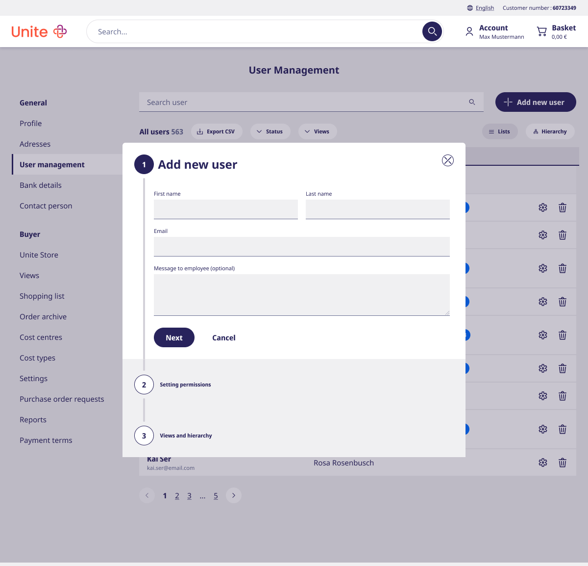
Previously, adding a user only created a bare account — permissions,
views and hierarchy placement all had to be configured afterwards,
in separate steps. The redesigned flow sets all of it up in one
pass, so a new user is ready to work the moment they're created.
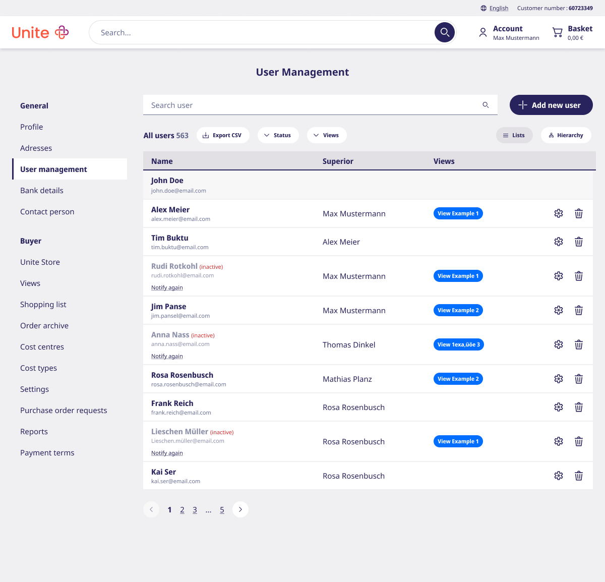
1User list
2Add new user
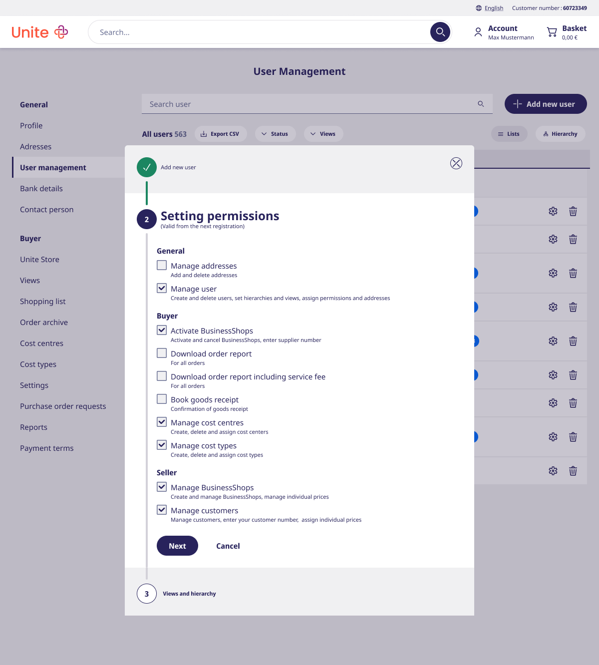
3Setting permissions
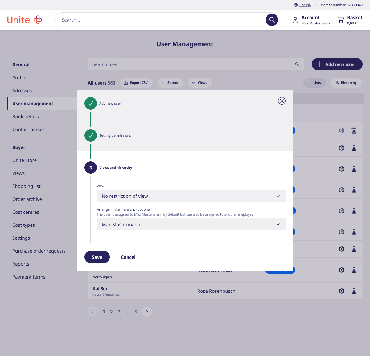
4Views and hierarchy
Fig. 13 — Creating a user, step by step. Permissions and hierarchy placement happen before the account exists.
1
Permissions move into creation. Rights are grouped by area — General, Buyer, Seller — and set before the account is saved, not after.
2
Hierarchy placement is part of the flow. The new user defaults to the creator's position, with the option to assign someone else — no separate trip to the hierarchy screen.
★ TBD · Placeholder
As this portfolio is newly rebuilt, this case study is still being
filled in — validation results and learnings for the admin journey
are on their way.